Gimme Some Skin - new forum look!

The friendliest place on the web for anyone that enjoys cooking.
If you have answers, please help by responding to the unanswered posts.
I see what Katie, June, Uncle Bob and the others are saying.

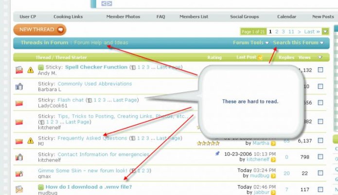
hard to read the yellow type against the blue background (date/time of postings, "View First Unread" bar)

hard to read list of blue "read" threads, blue type against white and gingham backgrounds

that tomato red color might be useful..............
 
Thread titles on the New Posts and Forum Listing pages are in a pale color. The reduced contrast makes them harder to read.

The text in the individual posts appears as black on white so that's not a problem (for me).

Also noticed that mods and admins are no longer identified as such in their posts.
 
well I get a pleasant surprise when I just visit DC a few minutes ago and saw this new look. I quite like it, very comfortable feeling.
 
Can you all describe the items that are hard to read? For example the threads seem pretty easy but the links at the very top that show were you are in the site (blue on blue) seem like they could be made easier to see. What exact areas of the site are hard to read?

The thread titles in pale blue and everything that's white with a light green background are making me squint, BIG time. The thread content is okay, altho black wou d be easier to read than that odd shade of blue.
 
Pale on pale is, frankly, not "a good thing" - lol!! And except for the individual postings, pretty much EVERYTHING is pale on pale. I'll be back after it's "tweaked". I have a headache already - lol!!
 
I don't much care for the color choice either.
Personally, I don't think it is more "professional" looking.
I REALLY don't like the ghost quotation marks either.
And I don't like the right hand side bar, but it is another spot for an ad,
so......

I will get used to it, I guess... but I don't like it. Looks amateurish, especially
the color choices, fat title bars, blue on blue type, dead green buttons...

not APPETIZING at all.

I couldn't possibly agree more with you, & have absolutely no idea why anyone felt this change was necessary. The site now looks very amateurish & at the same time resembles what Kraft Food Kitchens sends me via e-mail every so often. What, exactly, was the problem with the original setup? I don't remember anyone complaining about it. I guess we'll all get used to it. What choice do we have? Sad.:(
 
Thank you all for the feedback so far. It's going to take a few days to get it all organized and fixes made.

OK, so I have attached some screen shots of what I think you all are talking about. Can you please let me know if that is correct so I can work on fixing them?

Also, for those of you who want the old style back, feel free to choose it from the bottom left of every page (see attachment).
 

Attachments

  • forum display.jpg
    forum display.jpg
    56.4 KB · Views: 228
  • select skin.gif
    select skin.gif
    11.9 KB · Views: 208
Can you all describe the items that are hard to read? For example the threads seem pretty easy but the links at the very top that show were you are in the site (blue on blue) seem like they could be made easier to see. What exact areas of the site are hard to read?

Thread titles in the listing: Pale blue on white, too hard to read

Text in postings: light grey on white, too hard to read

The link at the top that shows where you are (Discuss Cooking - Cooking Forums > Discuss Cooking Community forums > Forum Help and Ideas > Gimme Some Skin - new forum look!) light blue on a blue plaid, way too hard to read

The rest is also fairly low contrast and hard to read, but mostly isn't content that changes, so I can live with it.
 
I agree that the new look does not look more professional. I think the other look was one of the more professional looking skins I have ever seen actually. That does not mean I do not like it though. I am not used to it yet and will need to play with it for a while before I have a valid opinion.

One thing I REALLY like though is how the forums are listed on the very top blue bar. that is really cool.

Andy, a bug I am noticing is that when you click on "your notifications " in the box on the top right it pops up under the blue bar so some of it is obscured.
 
I just wanted to update you all that I am working on various things now. I will post an update later with the changes. On the list is the ability to turn off the right column. Please be patient while I process the feedback and make adjustments.
 
Also, for those of you who want the old style back, feel free to choose it from the bottom left of every page (see attachment).

Oh thank you, thank you, thank you. My eyes, in particular, thank you. This format was/is perfect. So long as I can still access it - do what you will re: the new one - lol!!
 
Andy, the best way I can describe my difficulty reading it is that everything's a bit too "pastel." The colors are quite pale and might be better if they were more vivid or if there was more contrast. The blues and yellows seem to bleed into each other with no defined edges. My eyes are getting tired already and I never have trouble with them.
-------------------------------------------------------
I agree Katie. I find the light colors hard to read.
 
Back
Top Bottom